Design Studio Overview
Justuno Design Studio lets you build, edit, and customize fully responsive using our pre-built templates or a new template.
At a glance:
Accessing and Creating Designs
Last updated: 03/11/2024
Accessing and Creating Designs
To access your designs you’ll want to click on the Pencil Icon on the left-hand menu. Here you will be presented with your existing templates and allow you to create new designs. Within this page, you can also create folders and manage assets.
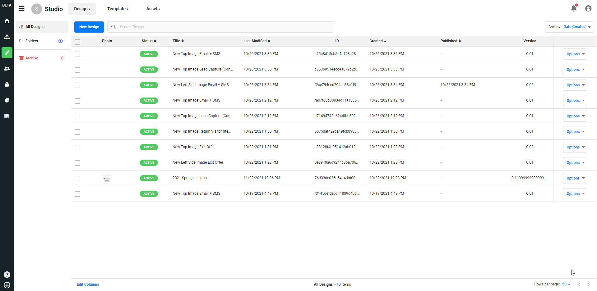 New Design - This allows you to create a design and presents you the following options:
- Blank Canvas - Create a brand new design.
- Import - Import a design by uploading a file.
- Saved Templates - Load previously saved templates.
- Browse Templates - Browse prebuilt templates created by Justuno
Folders - Creates a folder that you can use to organize your designs
Assets - Image files that you can upload and be stored for use in onsite designs
Design Studio
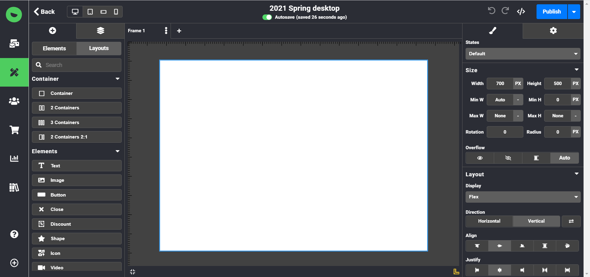
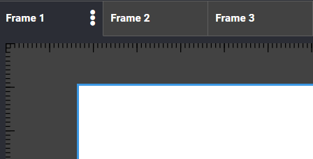
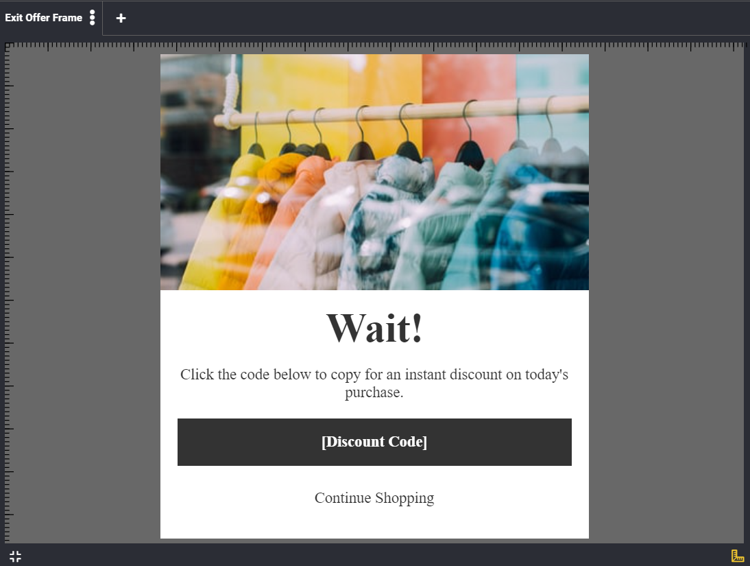
Frames - A piece of an onsite design. Formerly screens (intro, pre, post), instead of being pre-defined you can now have as many as you like. Add additional frames by clicking the plus (+) button. Rename your frames by clicking the three dots on the right-hand side of the selected frame.
Canvas Shape - How the onsite design will display on your website. For example center promotion, full screen, top banner, etc.
Elements - Elements that make up your onsite design. Click on the Element category names to expand all of their options. Elements are broken down into five categories:
- Content - Elements that make up your onsite design
- Form Fields - Data fields you’d like your visitor to submit. (I.E email address, phone number, etc.)
- Opt-ins - Facebook Messenger opt-in
- Games - Spin to Win and Weather
- Social - Add social media buttons that allow visitors to like/follow with a single click
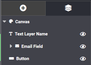
Layers - This allows you to drag and drop layers after they’re created
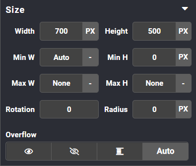
Design - Provides different options to apply to your layers such as position, size, opacity, colors, etc.
- Responsive Options - Set a responsive/sticky option to a dedicated layer (top, center, bottom, corners)
- Stroke - Border options that allow you to set color, px width, and pattern.
Settings - The settings tab will allow you to configure your element.
- Click Actions - A setting for a button element that will allow you to apply click actions: link to URL, link to frame, submit a form, close onsite, and copy to clipboard
Design Elements Breakdown
Content - Elements that make up your onsite design
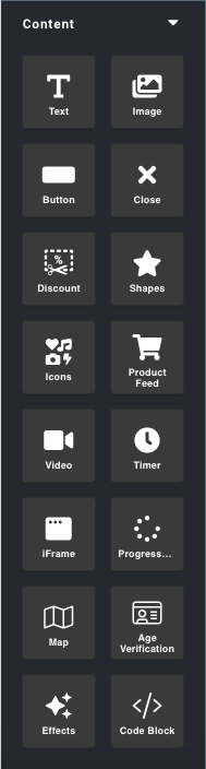
- Text - A text block with editing capabilities.
- Image - Where you can upload images or choose an image from your assets to use in an onsite design.
- Button - A call to action button. This can be used to navigate your customer to the desired URL or to submit a form
- Close - Closes the promotion.
- Discount (Formerly coupons) - How a coupon code is displayed in your onsite design. You can customize the font however you need to fit your branding.
- Shapes - Create an editable rectangle, ellipse, circle, or Bethlehem star layer in your onsite design. Shapes can have a click action added to them.
- Icons - This layer allows you to choose an icon from our icon library to display in your onsite design. Icons can have a click action added to them.
- Product Feed - This layer lets you edit your settings for your AI Product Feed. Plus/ PS only
- Video - This layer allows you to add a video to your onsite design and gives you options as to how it is displayed and if it’s autoplay, and what time to start and stop the video.
- Timer - A timer that counts down to a specified time.
- Slider - A container that can hold various other elements in a sliding carousel.
- Tabs - A container that can hold various elements that will display based on the tab that you click.
- Progress Bar - An animated display that shows you how much progress you have made on that particular frame. NOTE: You will have to determine the percentage of progress, the bar will not update on its own.
- Map - Display a Google Map showing a specified address in your onsite design. You can control how zoomed the view is and if it’s a roadmap or satellite view.
- Age Verification - Restrict frames of your onsite design with this layer based on the age a visitor enters.
- Effects (formerly Plugins) - An animated overlay layer for your onsite design.
- Code Block - Add your own custom code to affect how your onsite design is displayed or functions.
Form Fields - Field submission data that can be collected and passed to your ESP. You have to assign a form field to an attribute so it knows where to send data when it is collected.
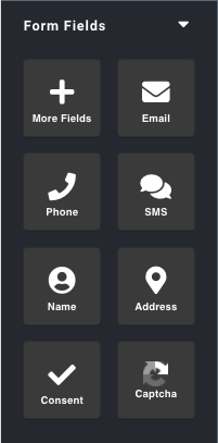
- More Fields - Create a custom field that will pass data to your profile attributes when filled out.
- Email - Collect email addresses to your profile attributes or pass them along to your EPS.
- Phone - Collect phone numbers to your profile attributes or pass them along to your SMS app/ ESP.
- SMS - SMS phone number field
- Name - Name Field
- Address - Creates five fields address fields by default (Address, Address 2, City, State, Zip). You can delete fields as needed.
- Consent - A consent checkbox
- Captcha - Captcha to deter bots or spam submissions.
Opt-ins -
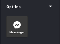
- Messenger - Adds an opt-in for Facebook Messenger bot suites. Add your Messenger App ID and Page ID within the Settings tab on the top-right corner.
Games - Gamification options to use an incentive to increase engagement
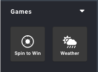
- Spin to Win - A Spin to Win game is used as an incentive to increase engagement.
- Weather - Weather display based on your visitors' geolocation.
Social - Social media buttons that allow visitors to easily follow and like your social media accounts with just a click.
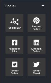
- Social Bar - Creates a bar with four social icons which you can connect to the following social media services: Facebook, Twitter, LinkedIn, YouTube, Instagram, Pinterest, Snapchat, Skype, Dribble, Vimeo, Tumblr, Foursquare, StumbleUpon, Flickr, Reddit, RSS
- Pinterest Follow - adds a button that allows your visitor to follow your Pinterest account.
- Facebook Like - adds a button that allows your visitor to like your Facebook account.
- LinkedIn Follow - adds a button that allows your visitor to follow your LinkedIn account.
- Twitter Follow - adds a button that allows your visitor to follow your Twitter account.
Visit Justuno @justuno.com