Side Tab Button
In this Justuno support article, we break-down the steps needed to implement a side tab button in the design studio.
At a glance:
Last updated: 03/24/2025
Introduction
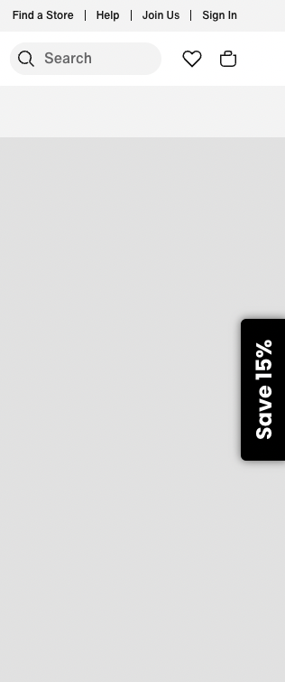
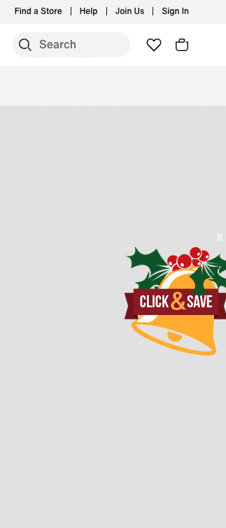
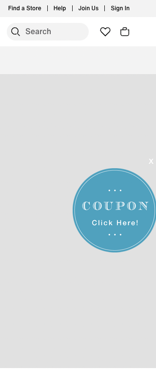
A Tab Button is a fixed text/image that hovers on the perimeter of your website. These can be used to trigger one of many button click actions.
However, the most common use case is to utilize it as a promotion trigger (Link to Frame). Whether you're looking for a non-intrusive way to present an offer or providing a re-engagement opportunity on an initial offer, Tab Buttons help maximize engagements.
Add & Edit
NOTE: A Tab Button is simply an additional frame in your design sequence and should be treated as such (frames are the succession of steps in a single design).
- Jump into the design for which you'd like to implement a Tab Button. Navigate to the Frames section in the left side menu and select Add New Frame.
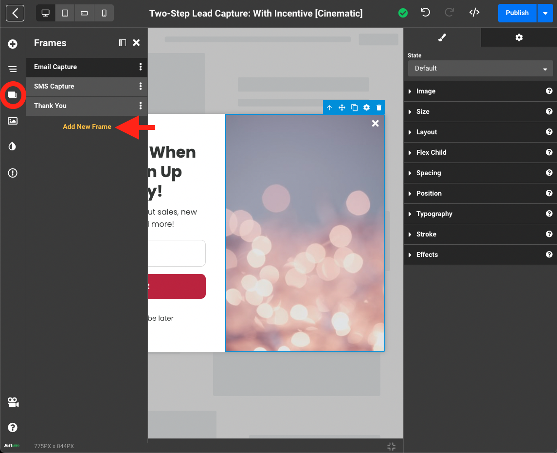
NOTE: Frames are queued up based on their order in the Frames menu. If the Tab Button is the first frame your want visitors to see, rearrange (drag-and-drop) the frames so that the Tab Button frame sits above the rest.
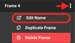
OPTIONAL: You may also consider renaming the new frame by clicking on the vertical ellipsis (⋮) to the the right of the frame.
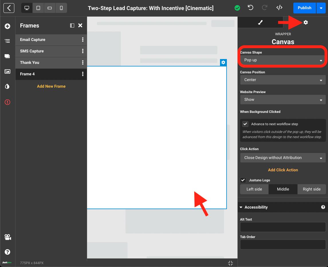
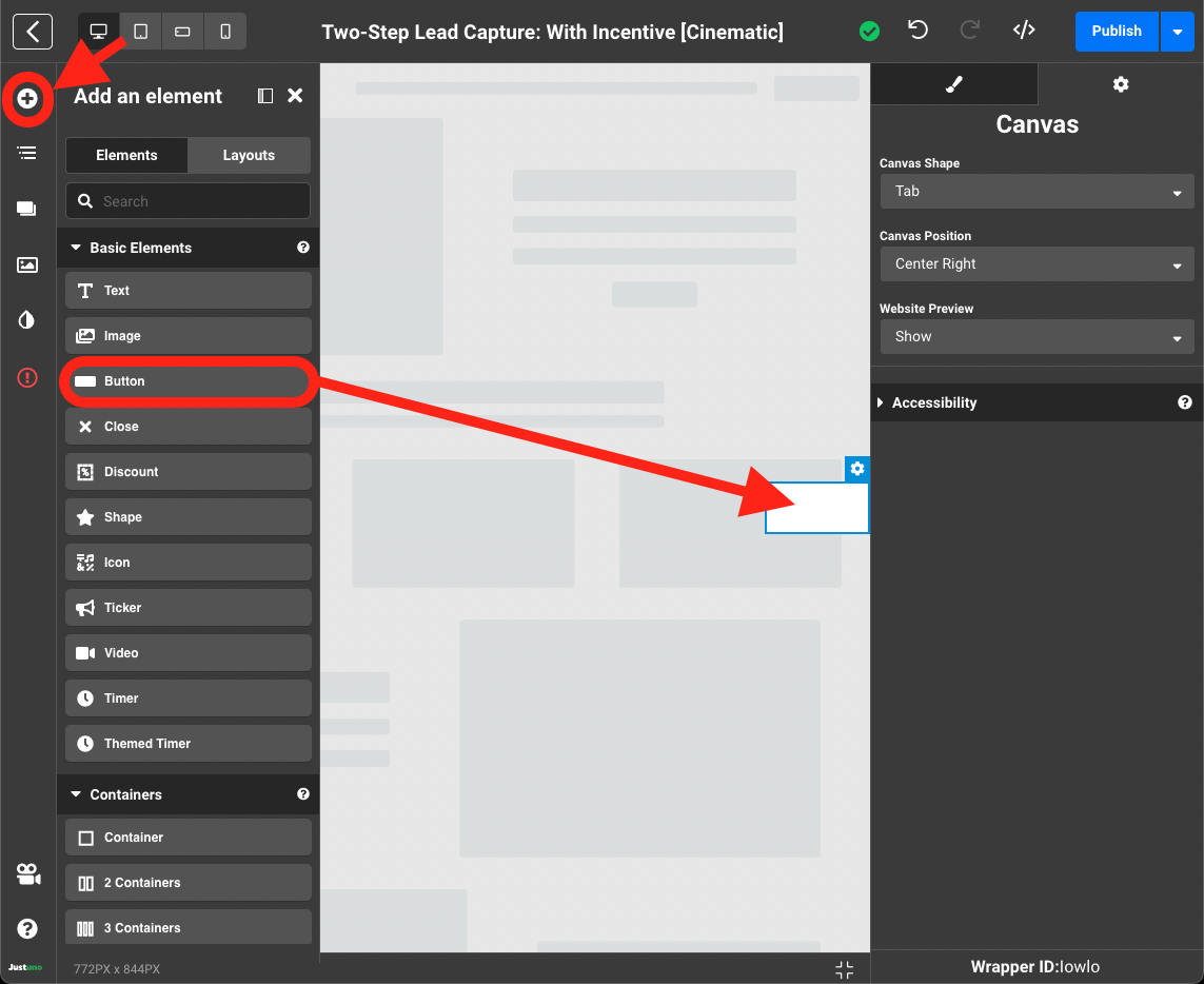
- Once you've added a new frame, select the blank canvas and navigate to the settings tab on the right side menu. In the Canvas Shape drop down menu, find and select Tab.
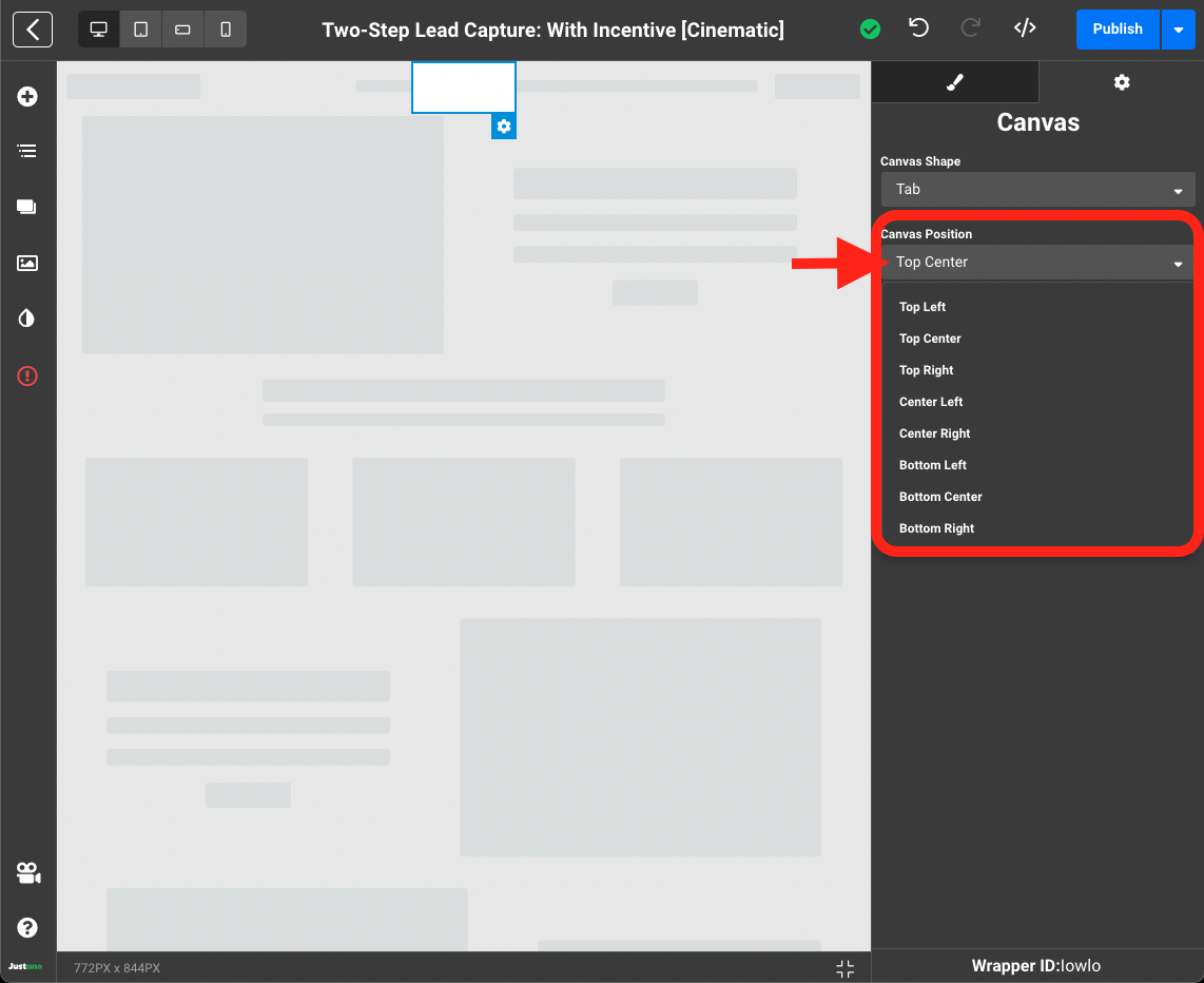
- With your blank canvas now converted to a Tab. Set your Canvas Position. Your Tab Button can be anchored to left, center or right of any side in the viewport.
- Now that we have the Shape and Position properly set, select the Add an Element icon the left side menu and drag-and-drop a Button element into your blank canvas. Alternatively, an Image element may be used here if you'd prefer to upload your own Tab Button graphic.
- Personalize you newly added Button/Image element as you would any other design frame (sizing, colors, font etc.).
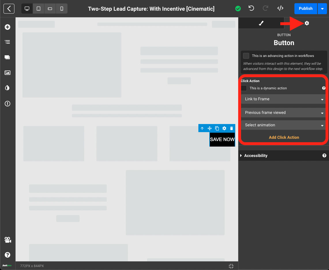
- Once the visual component is complete, navigate to the settings area within your Button/Image element and locate the Click Action area. Set the Click Action to Link to Frame. By default, it will link to the Previous Frame Viewed. You will also see an option to Select animation which is a transition effect that can be applied to the subsequent frame.
- The last and most important step is to modify every close element click action to link to your Tab Button Frame. This ensures every action taken to close the design will open the Tab Button Frame instead. Except of course the thank you/final frame of your design which should simply close the pop-up as your visitor is done.
- That's it - your Tab Button design is ready for use!