At a glance:
Introduction
Accessing States
Last updated: 04/04/2024
Introduction
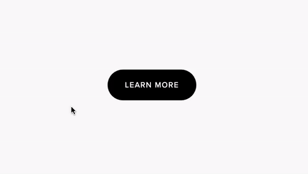
States allow you to make local style adjustments on an element based on the cursor behavior. This includes but are not limited to the color, font and size of the element. There are four primary states: default, hover, clicked/pressed and active/selected.
Accessing States
While working on a design, States can be found by clicking a container and navigating to the State drop-down form on the right-hand side menu. Simply choose the state you'd like to edit in and make style adjustments as you would with any regular container or element.

Default - Default styles are applied to all element states.
Clicked/Pressed - Clicked or pressed styles are applied while the element is clicked on or pressed (on a mobile device).
Hover - Hover styles are applied when the element is hovered over by the cursor.
Active/Selected - Active styles are applied after the user clicks (or selected) an element, but before un-selecting the element.
Note: Style inputs derived from the default state will be indicated in yellow unless changed.
