Building Designs: Pop-ups, Flyouts, Banners, Embedded Designs, and Other Widgets
Learn how to create and save designs in the Justuno design editor for seamless promotional campaigns.
On this page:
Welcome to the world of design building with Justuno! This guide will walk you through the process of creating, saving, and configuring the designs in your workflow. By using our intuitive design editor, you can easily create eye-catching pop-ups, flyouts, banners, embedded designs, and other interactive widgets to enhance your marketing efforts.
Selecting a Design:
Let's begin the design journey with these simple steps:
Step 1: To start creating your design, you have a couple of options:
- Choose a pre-made design from our template library and customize it to match your desired look.
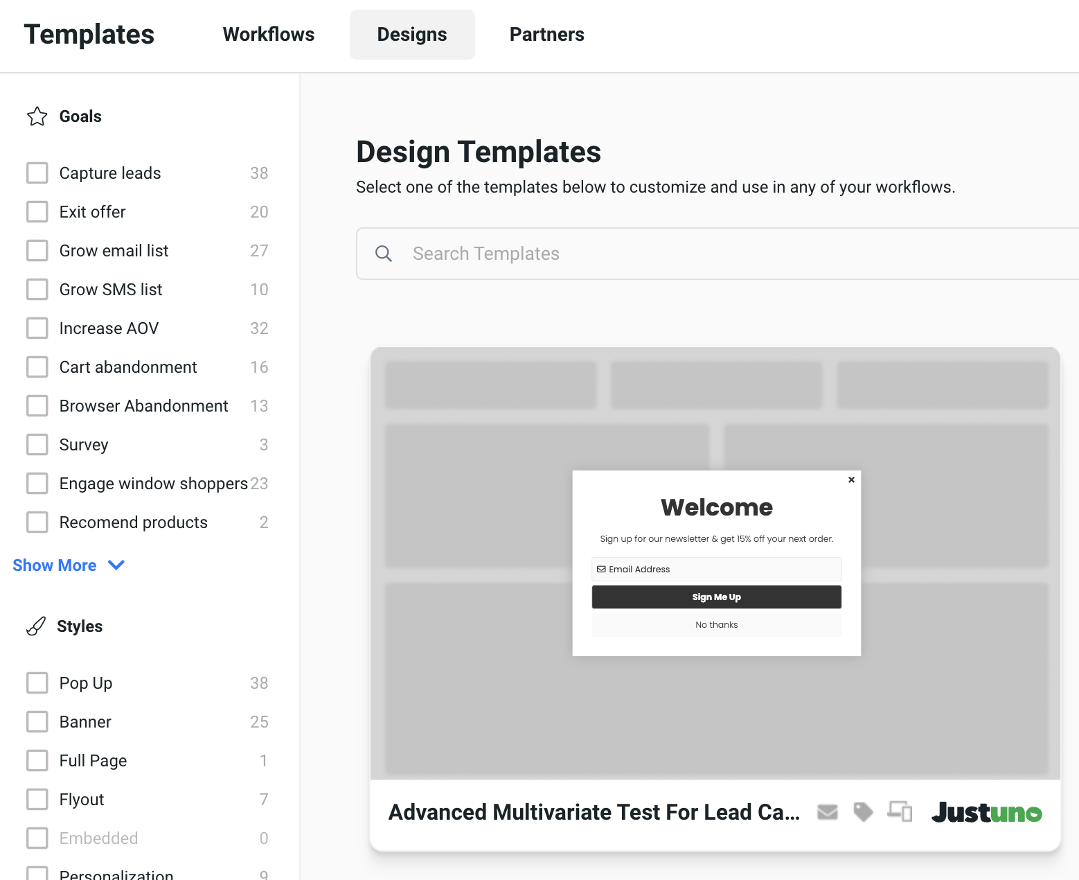
- Drag the "Design" element from the left side under "Add" to your workflow. Then, you can either choose from your saved designs, start a new design from scratch, or import a design from another website account that has already been exported.
Step 2: Once you've selected the design, you'll be taken to its settings, where you can further configure it. For more details on design settings, you can jump to the designated section.
Note: All your saved designs can be easily accessed through the way mentioned above or via the Studio tab in the left column of your screen.
Configuring Your Design Settings:
Now that you have your design selected, let's configure its settings to match your campaign needs:
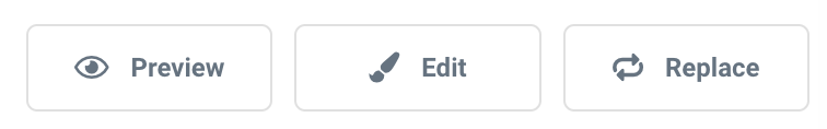
Step 1: Begin by previewing, editing, or replacing your design. To learn more about previewing your design, click here.
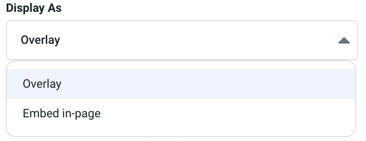
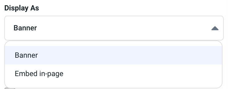
Step 2: Choose how you want your design to be displayed: as an overlay, embedded in the page, or as a banner.
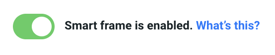
Step 3: Decide whether to enable the Smart Frame feature. With Smart Frame enabled, visitors who trigger a design more than once in a session will see the next frame in the design's sequence, while frames containing form fields with known visitor properties will be skipped.
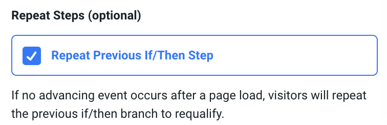
Step 4: Select if you want the design to repeat the previous "if/then" step. If no advancing event occurs after a page load, visitors will repeat the previous "if/then" branch to requalify.
Note: Advancing actions will appear as a quick look once your design is configured. These actions allow visitors to complete the current design step and move to the next step of your workflow (or unenroll). You can designate advancing actions in the element settings.
Editing and Building Your Design:
Now that we've set the foundation, let's dive into editing and building your design using the design canvas:
- Add an Element: Choose between individual elements or premade layout configurations.
- Containers: Within elements, select your containers, which act as building blocks for your design.
- Elements: Choose individual elements to add, such as a text box, image, button, close button, discount, shape, icon, video, timer, or themed timer.
- Profile Properties: Options include email address, phone number, name, address, consent checkbox, SMS opt-in button, or more properties for additional options.
- Basic Form Fields: Build forms from scratch with this basic form field builder. Options include short text, long text, radio button, checkbox, single select, and date.
- Design Blocks: Choose prebuilt design elements such as product recommendations, spin to win, age verification, code block, or weather to add to your design.
- Social: Add social buttons to your design, including Pinterest follow, LinkedIn follow, Twitter follow, or Twitter tweet.
- Navigator: Easily manage layers in your design by clicking on each layer to edit or move them around. Ensure specific layers are always on top, such as form field layers.
- Frames: See and edit each frame or step in your promotion within this section.
- Asset Library: Access your asset library and use searchable stock photos to enrich your designs. To learn how to set up your asset library, check out this article: [Link to article]
- Font & Colors: Utilize your brand kit to create on-brand designs. Learn more about creating your brand kit here [Link to article].
- Design Audit: Check your design for any urgent updates, suggested updates, or skipped updates to ensure there are no errors or missed steps, and that you've created an optimized design.
By following these steps and exploring the various design elements, you'll be able to create captivating designs that align with your brand and make your promotions stand out.
If you have any questions or need further assistance, feel free to reach out to our support team. Happy designing with Justuno!