Reports & Dashboards Overview
In this Justuno support article, we will cover where to locate each of the analytics dashboards and how to understand the reports in each one.
At a glance:
Introduction to analytics in Justuno
Introduction
Justuno's reporting dashboards can be found in multiple places throughout the app, and each one is designed to provide a purposeful view of website and behavioral data collected. First, let's define each dashboard, it's main purpose, and where to find it.
Locating each dashboard and understanding it's purpose
There are three main analytics dashboard in Justuno:
- Account overview dashboard: located on the home section of the platform, this dashboard provides a holistic view of Justuno's performance on your website.
- Workflow & multivariate test smart reports: located in the performance area or the Flows section. these are dynamic reports for each of your workflows that show overall workflow performance, along with each design and multivariate test contained within.
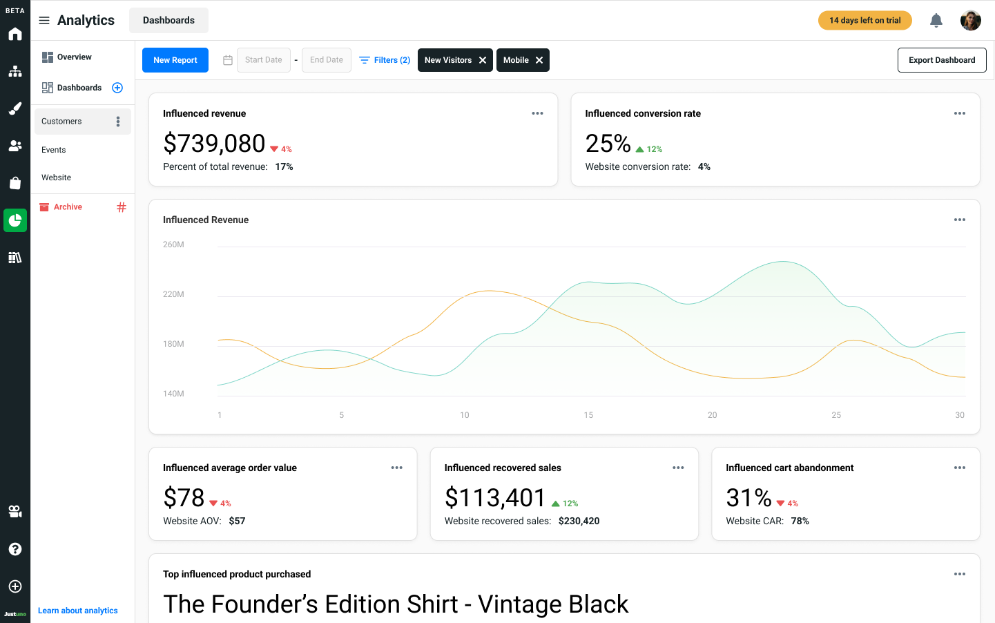
- Analytics section & custom reports: these dashboards are housed within the Analytics section of the platform, and are separated into four main reports: Customers, Events, Website Data, and Custom Reports - read more below.
Account Overview
The account overview dashboard is located in the Home section of the platform. Use this dashboard as a quick check-in and to monitor the overall "health" of Justuno's performance on your website.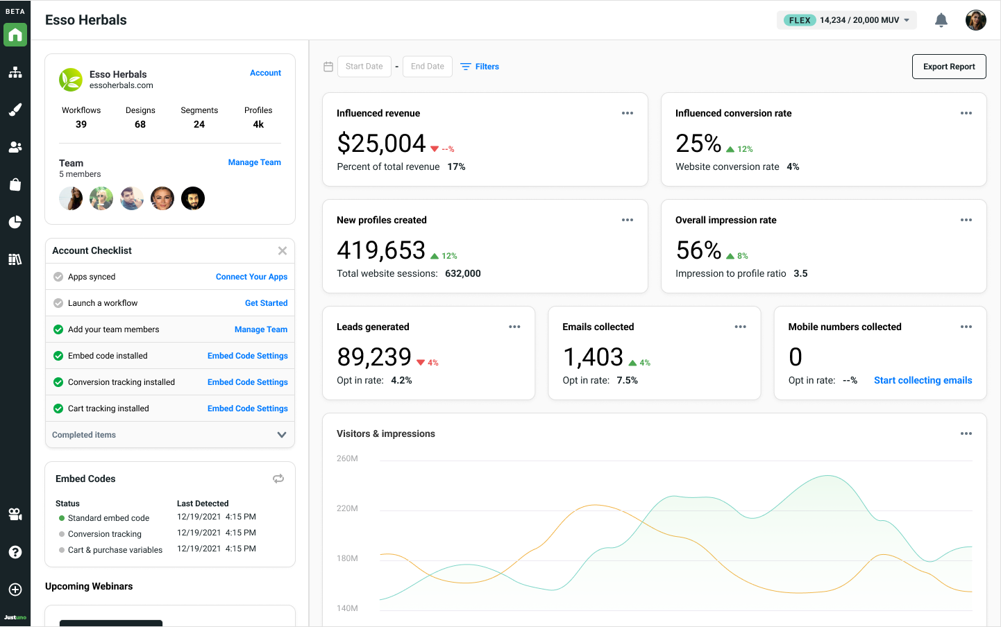
Common scenarios: checking to make sure Justuno is correctly embedded and live on your website, seeing if overall revenue or conversion rate has improved or declined in a specified date range, or seeing how many leads have been captured recetly.
Workflow & multivariate test smart reports
Workflow and multivariate smart reports provide workflow-specific performance reports, along with detailed reporting on individual designs and multivariate steps used in the current workflow being analyzed.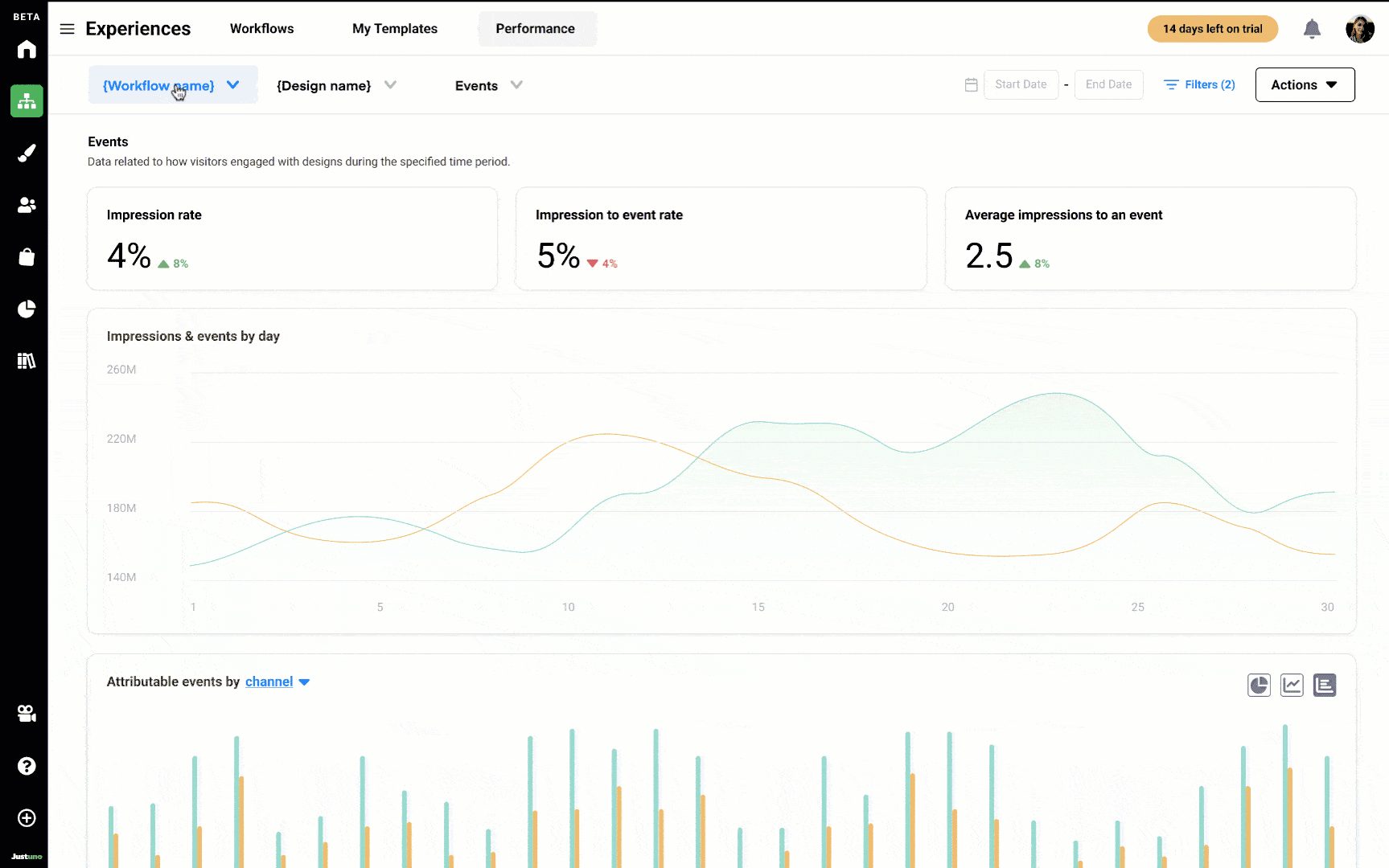
⚡ Why is it "smart"?
Within the design reports of these dashboards, there is a section that reports on any profile properties, aka form fields, used in the design and automatically updates when a new version of the design is published.
Multivariate testing dashboard
Once your AB or multivariate test reaches above 60% statistical significance, you can view the test results up to that point in time. Although it can be accessed before high confidence has been reached, we don't recommend analyzing results.
Determining a winner of your test is reliant on choosing your primary goal for the test. In the screenshot below, we are looking to see how the variants perform against each other based on influenced conversion rate (read more about influenced metrics here).
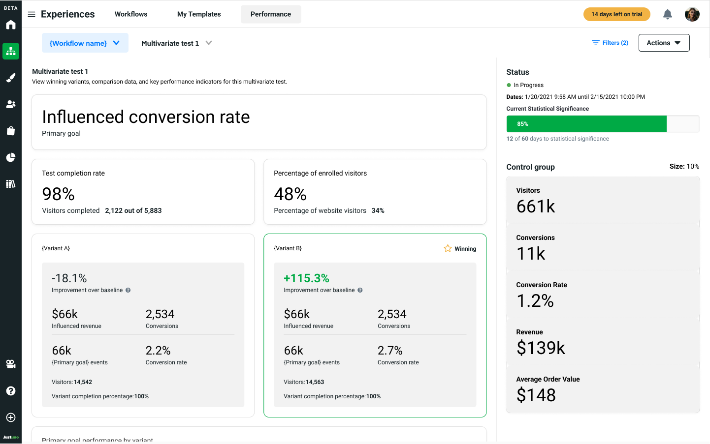
📈 What is the "improvement over baseline" and how is it calculated?
If your test's primary goal is a metric that is also measured by a control group, the baseline is that control group metric, and percentage improvement shows how well the variant performed against the control. In scenarios where the primary goal cannot be measured by the control group (i.e. lead capture rate), the performance over baseline is calculated by comparing the each variant against the worst performing variant, using the primary goal event.
Analytics section & custom dashboards
The analytics section is similar to the account overview in that it contains holistic reports about Justuno's performance on your website, though more detailed and categorized into customers, events, website data, and custom dashboards.
- Customers: data related to revenue and conversions, such as conversion rate. revenue, and more.
- Events: data related to visitor interactions with Justuno elements on your website, such as form submissions, button clicks, and more.
- Website: reports related to visitor behavior while navigating your website, including time on site, pages per session, and traffic sources.
- Custom: reports created by team members and collaborators of your account.
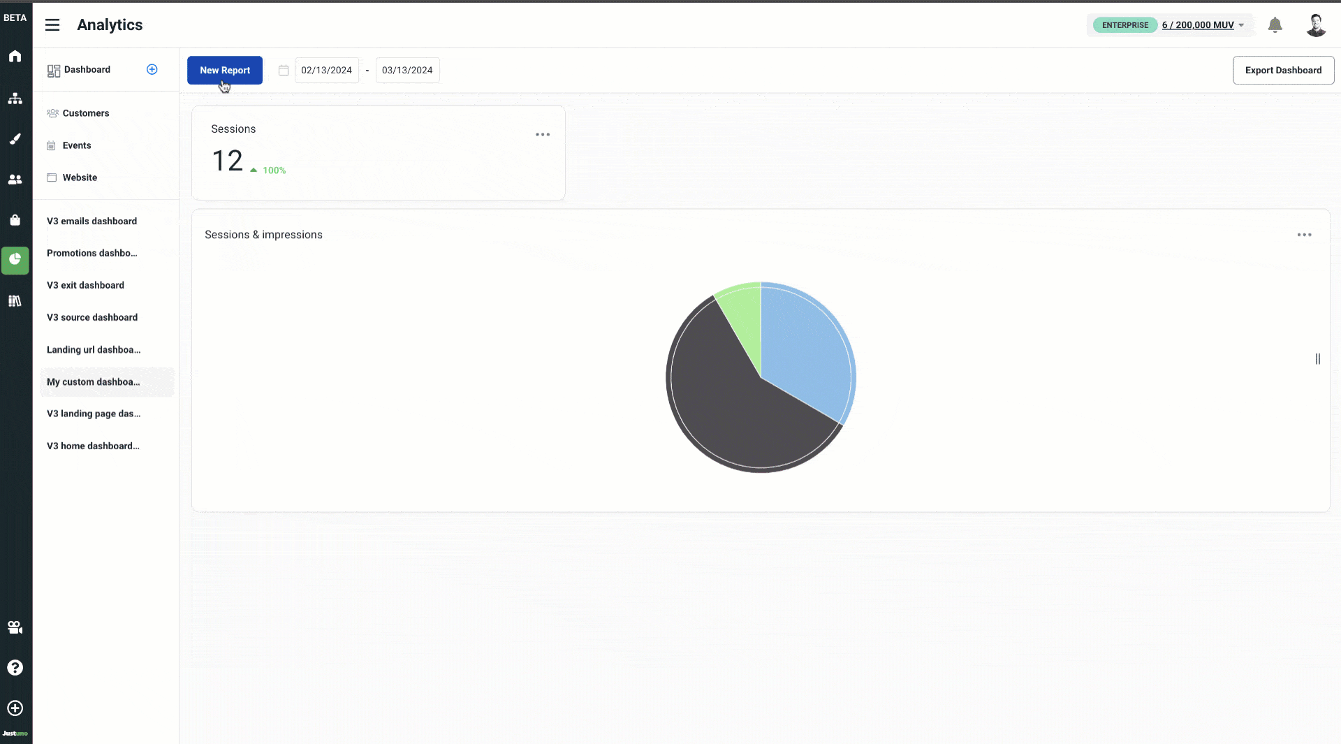
Custom dashboards (Flex & Enterprise plans only)
Custom dashboards, available to Flex and Enterprise account holders, allows you to build completely unique and specific reports to fit your business needs.
To access custom reports, you. must create your own custom dashboard by clicking the blue plus icon from the submenu options.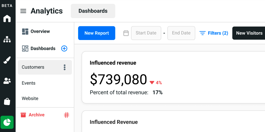
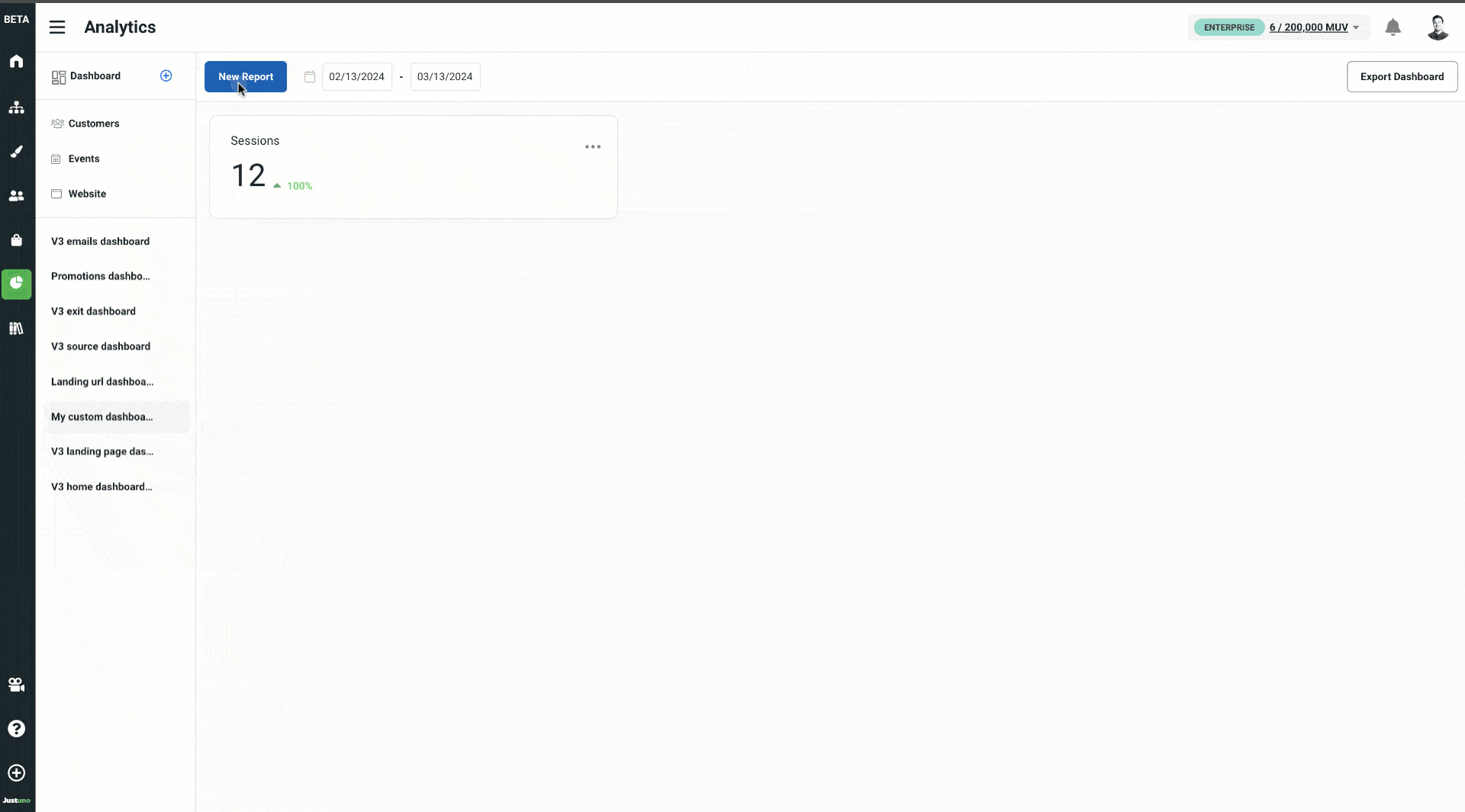
Once you have named your dashboard, you are ready to start creating any of the following three types of reports:
Summary reports: create a card that contains an output of a single data point, such as "emails collected" or "average order value".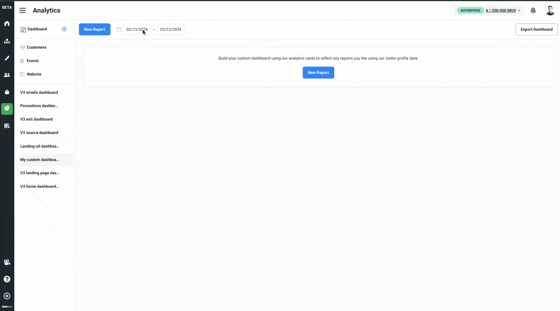
- Chart reports: build either a line, bar, or pie chart, allowing you to plot one or more data points with an x and y axis
- Tables: show records of multiple data points relating to a primary data source (i.e. the initial column), such as sessions + impressions + events based on channel.