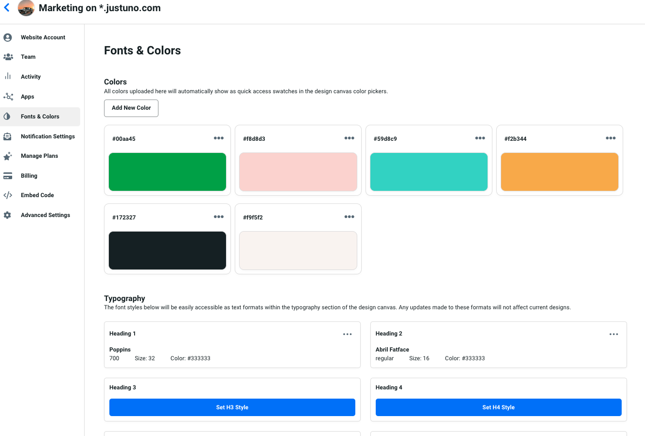
Fonts and Colors
Where various assets such as brand colors, logos, and fonts are uploaded and stored for automatic use in your onsite designs for a quicker turnaround.
At a glance
Last update 10/21/2021
Introduction
The new Fonts and Colors feature allows you to define aspects of your brand to simplify the process of creating designs. Fonts and Colors can be found in the Website Settings. Having a noticeable brand helps visitors remember your site. Continue reading for a walkthrough of the separate attributes within this tool below.
Features
Logos - Upload your logos into your brand kit to make them easily accessible for use in your onsite designs.
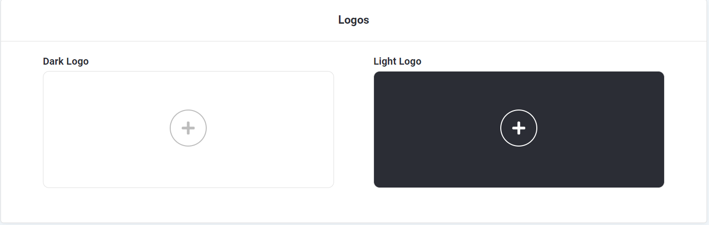
Dark - Dark logos are comprised of colors that would look good on a white or light-colored background.
Light - Light logos are usually white or lighter colored and look good on darker backgrounds.
Colors - A pre-defined color palette of your brand colors that automatically assigns a color to elements when you create your onsite designs.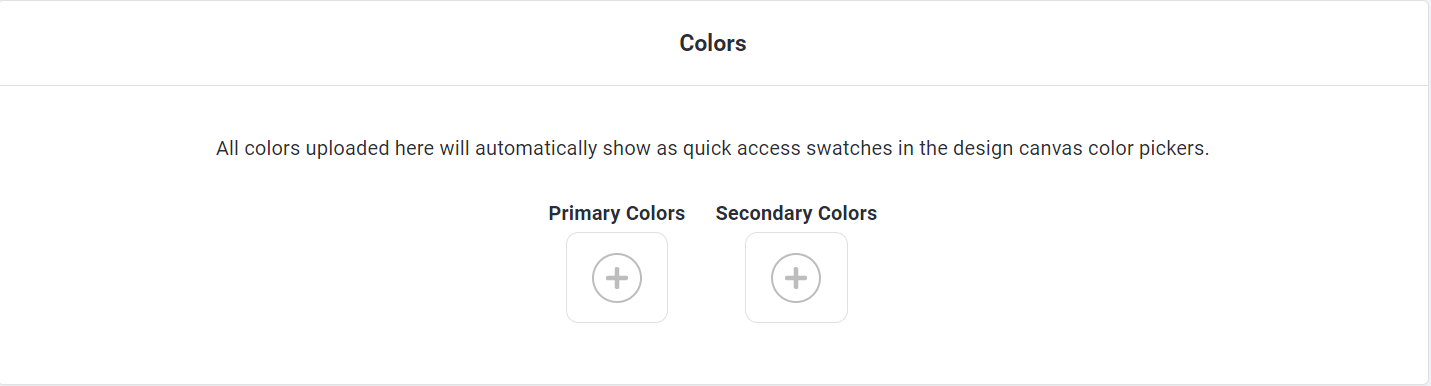
Accent -
Buttons - Define the color you would like to be automatically applied to all buttons in your onsite designs.
Button Text - Define the color you would like to be automatically applied to all of the text on your buttons in your onsite designs.
Links - Define the color you would like to be automatically applied to all of the hyperlinks in your onsite designs.
Text - Define the color you would like to be automatically applied to all of the text in the text boxes in your onsite designs.
Fonts - Set your brand fonts in your brand kit to be automatically applied in your onsite designs.
Heading - The font that will automatically be applied to all H1 text blocks.
Subheading - The font that will automatically be applied to all H2 text blocks.
Body Text - The font that will automatically be applied to all text blocks marked as paragraphs.
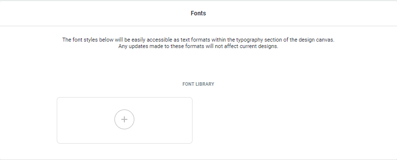
Font Library
Upload and manage your custom fonts in the Font Library for use across all onsite experiences.
Supported Font Sources

Google Fonts
Search and select from the available Google Fonts directly within the font selector. These fonts are natively supported through the integration and can be easily applied to your designs without additional setup.
Adobe Fonts
Adobe Fonts are supported via custom integration. To use an Adobe font, provide your Adobe Web Project CSS link, which will load your selected fonts into Justuno for use in your Brand Kit.
To find the Adobe Web Project CSS link, locate the embed code within the project settings. From this embed code, copy the stylesheet URL (for example, https://use.typekit.net/xxxxxxx.css) and provide that link.

Custom Fonts
Custom fonts can be uploaded directly into Justuno and used across your Brand Kit. Supported file types include OTF, TTF, EOT, and WOFF (or you can drag and drop files directly into the uploader). Once uploaded, the fonts will be available in your Font Library and can be applied to headings, subheadings, or body text across your onsite experiences. Each file must be under 4 MB in size.
For best performance and faster loading times, it is recommended to use WOFF2 format whenever possible, as it provides better compression and more efficient delivery across modern browsers.

Visit Justuno @justuno.com